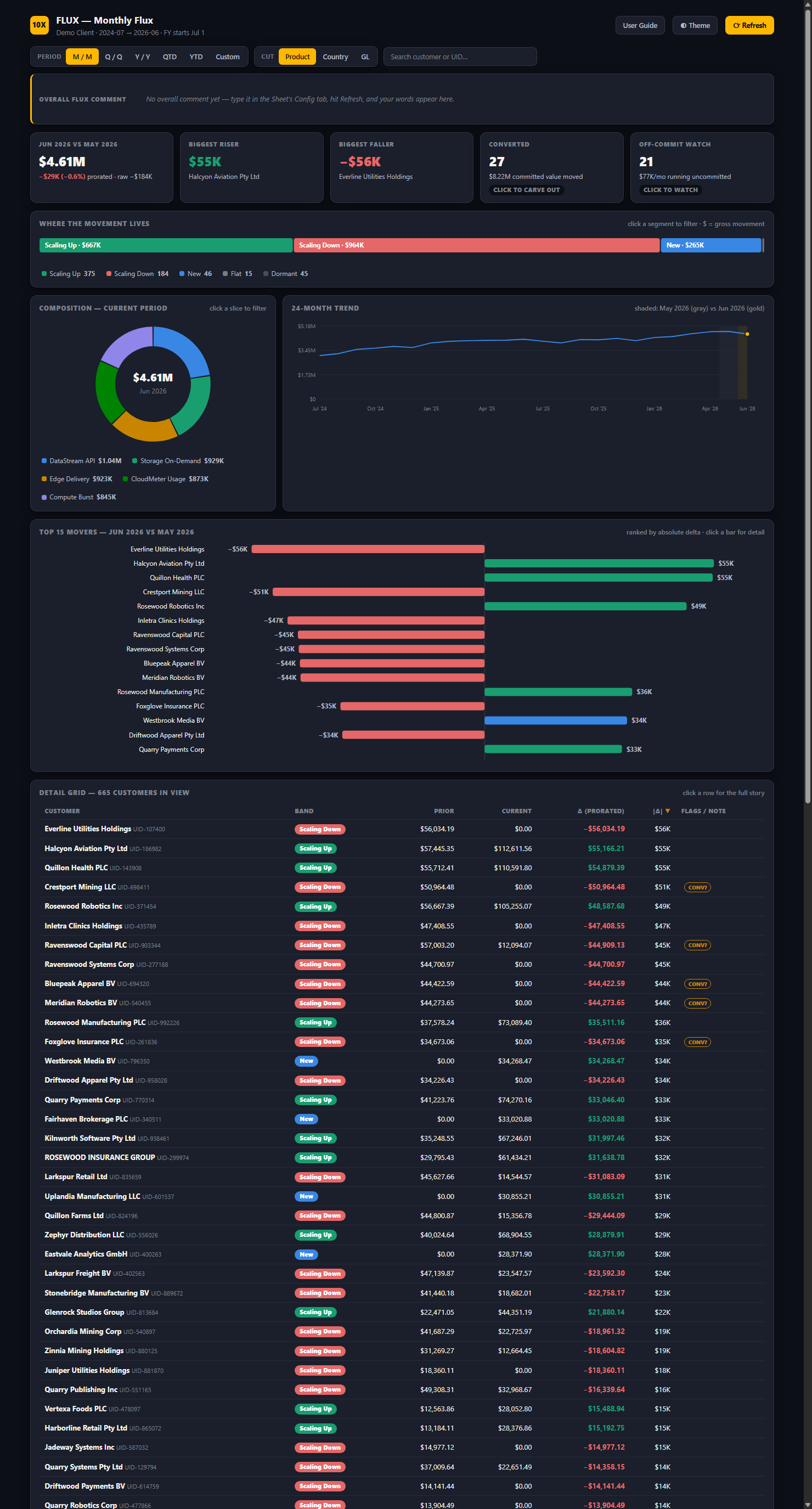
A boardroom-grade dashboard that turns your raw numbers into a story you understand in five seconds — and can drill into in three clicks. Built inside the Google Workspace you already own, for a fraction of what the big tools cost.
Your data never leaves your walls · You own it outright · No Tableau, no Looker, no lock-in
Every business already has the numbers. What almost none of them have is a clear, instant answer to the only question that matters every month: what changed, and why? That answer is usually buried in a spreadsheet nobody has time to dig through — or trapped in a $30,000-a-year tool only the enterprise can afford. This page is about giving you that answer for the price of a website.
Ninety seconds of reading. If your business compares one period to another — and every business does — the next section is going to feel like it was written about you.
Watch a real dataset become a dashboard an executive can read at a glance — the tiles, the movers, the drill-downs, the one-click refresh that sends the finished view straight to the boss.
Prefer the full walkthrough? It's on our YouTube channel.
The engine doesn't care what your numbers are — only that you have two of something to compare. This month vs. last. This location vs. that one. Plan vs. actual. Any business, any dataset, one question answered: what moved, and why.
Sales by store, by category, by SKU — every month, every season.
"Which location and product line drove the swing?"
Covers, average check, and food cost across locations and weeks.
"Why was this month down when foot traffic was up?"
Revenue by provider, service line, and payer, period over period.
"Which service line is quietly shrinking?"
Revenue and margin by client and project, month over month.
"Which accounts grew, and which are slipping?"
Orders by customer, region, and product line, quarter over quarter.
"Where did volume actually move?"
Revenue by plan and cohort — with churn and upsell separated out.
"Is that drop a loss, or revenue that moved?"
Income and occupancy by unit, building, and portfolio.
"Which properties are trending the wrong way?"
Donations by campaign, channel, and donor tier, year over year.
"What's driving this year vs. last?"
Plan vs. actual on any line, with the biggest variances first.
"Where are we off plan, and by how much?"
No new software to learn, no login to remember. It lives in the Google Workspace you already run.
Export from whatever you use — your POS, QuickBooks, a spreadsheet — and drop the file in a folder. That's the whole monthly ritual.
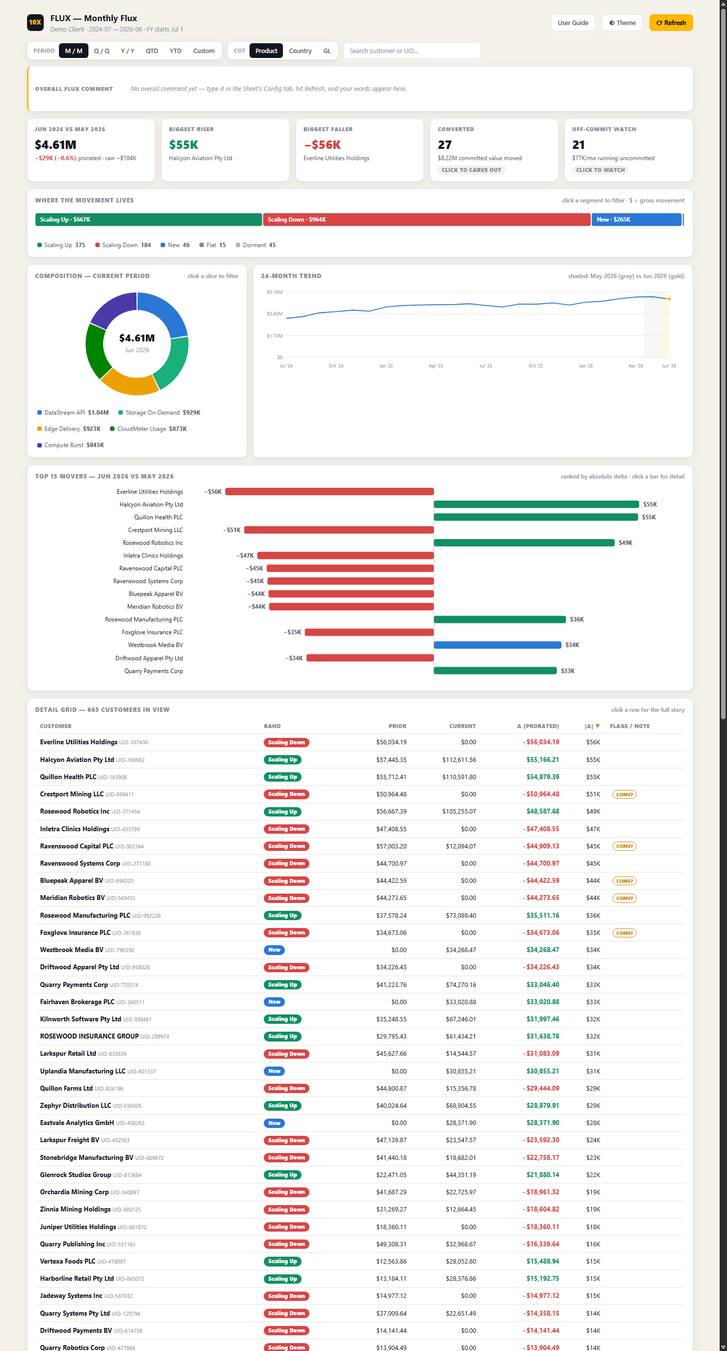
The dashboard shows what changed the instant it opens: the biggest movers first, filters and drill-downs one click away, your own notes built in.
Hit refresh, add your commentary, and send the link to your boss, board, or partners. No deck, no export, no meeting required.
Clean enough to put in front of your board — deep enough to answer the follow-up question before it's asked.
Anyone can draw a bar. The value is in the reasoning — the judgment of a seasoned analyst, encoded so it runs the same way every month, without a word of it made up by a machine.
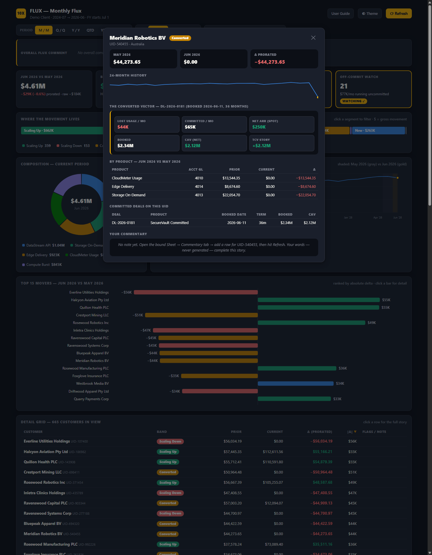
The largest moves rise to the top automatically — up or down — so the story explains itself the instant the page loads. No hunting.
Uneven months are corrected before anything is compared, so a shorter month never masquerades as a real trend.
When a customer's number falls because their spend moved elsewhere — not because they left — the dashboard catches it, so you never sound the wrong alarm.
Every word of narrative is yours, typed in your sheet. Nothing is machine-written — because a number you can't defend to your board is worthless.
The dashboard lives in your accounts, in your name, on data that never leaves your walls. No platform holding you hostage.
The tools the Fortune 500 use for this run $10K–$50K a year. This is a one-time build and a small monthly. Same clarity, real-world price.
Open it and the month is already explained — no more digging through tabs before a meeting.
One link, always current. Refresh, add your note, send. The monthly reporting scramble is over.
Nothing is uploaded to us or anyone else. It runs privately inside your own Google Workspace.
Built in your accounts, in your name. No subscription to a platform that could disappear or hike its price.
The clarity a Fortune 500 finance team pays six figures for — for the price of a website.
Mapped to your actual numbers and the questions you actually ask — branded as yours.
A one-time build, deployed in your own Workspace, with an optional monthly plan to keep it running and keep us on call.
Keep the monthly data flowing and put us on call. Plans run $79 / $149 / $299 a month for 1, 3, or 5 service requests with 48-hour, 24-hour, or same-day response. A request is any ask — a tweak, a new view, a question. Anything that breaks on our end is always fixed free.
Tell us where to reach you and a little about your business. We'll show you exactly what your dashboard would look like — before you spend a dollar.
No obligation. No spam. Just a look at what's possible for your business.